Life in Technicolour
Sustaining brand integrity with the vibrancy of colour and resilience of steel
Story: Ian VanDuzer
Photography: Sandra Mulder, Daniel Banko
Way back in 1939, the world was amazed by the Wizard of Oz. Dorothy, picked up from sepia-toned dustbowl Kansas, landed in the brilliant and beautiful Technicolor world of Oz, right on top of a Wicked Witch.
85 years later, and steel is having a similar ‘Technicolour’ moment. Steel’s colourful transformation wasn’t as quick or as dramatic as Dorothy stepping onto the Yellow Brick Road, but it’s here now and will be forever moving forward.
For a long time, steel came in two colours: gray and rust. Attempts to make steel more colourful were resisted by many factors: there wasn’t a paint that would stick to the metal, or it would fade too quickly. It would warp and the colours would shift in the manufacturing and construction process. It just wasn’t worth the bother.
Until suddenly, paints changed. Steel changed, too. And now, companies like Baycoat boast that steel can be painted in thousands of different colours, tones, and shades.
Some architects are starting to use painted steel to its full effect: not just to create beautiful works of art, but also to more identify buildings with their clients and their brands. Recognizability isn’t limited to building shape any more: you can use colour now, too.
Not Just Any Yellow
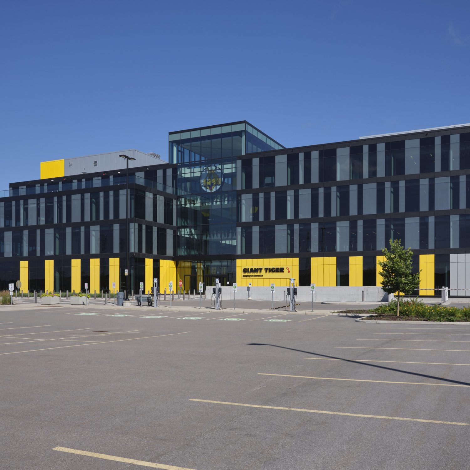
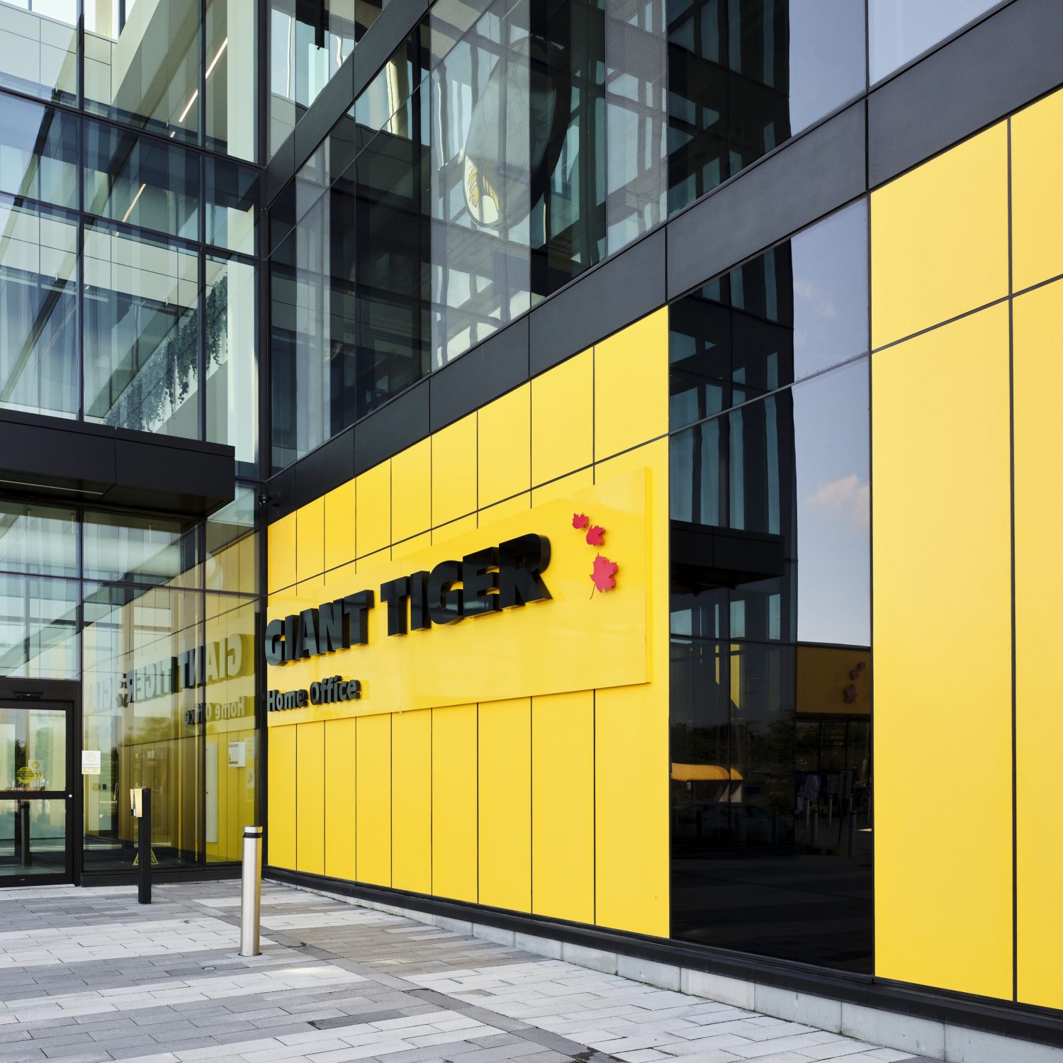
Courtney Posel – Architect, Team Lead at GKC Architecture & Design – worked on designing the head office building for Canadian retail chain Giant Tiger. Founded in Ottawa, Ontario in 1961, the new head office left the capital’s downtown core in favour of more space, and better access to transportation.
The façade of the new head office is magnificent, a mixture of bright, brand-adhering yellow steel panels and smoky-gray glass that literally shines as you pass it.
“We wanted something that’s visually great,” says Posel. “Something you can see from the highway and say, ‘That’s Giant Tiger. That’s their colour.’”
According to Posel, using that yellow was a choice made very early on in the design process. “I mean, it’s the Giant Tiger yellow. That was always the colour that we were going to use on the building.”
But it couldn’t just be a yellow. It had to be THE yellow. Giant Tiger’s yellow. So, Posel had to get the specific colour swatch from their client’s brand handbook. With that in hand, she could make sure the colours would match perfectly.
“If you’re going to do something, you have to do it right,” says Posel. “Especially if you’re dealing with a brand. They have their colours for a reason.”
Colours of the Rainbow
Bright, bold colours aren’t anything new for Posel, who regularly integrates them into her designs. For her, colour is easy: “We use IMPs [Insulated Metal Panels] in a lot of our projects,” she says. “They’re easy to install, they’re versatile, and they have a great thermal rating – which is pretty necessary in Ottawa!”
And, they can be painted any colour under the rainbow. We asked Posel what that process of matching exact colours was like, and if it was difficult to source the colour.
“For us, it’s a really simple process,” Posel laughs. “We send Norbec – the IMP manufacturer – the colour swatch, and they send us back a sample. We check the sample, and then a bunch of steel arrives at the construction site.”
The behind-the-scenes process is a little more in-depth.
Most mills and manufacturers don’t paint their own steel. If they do, their colours are often limited to a handful of stock options.
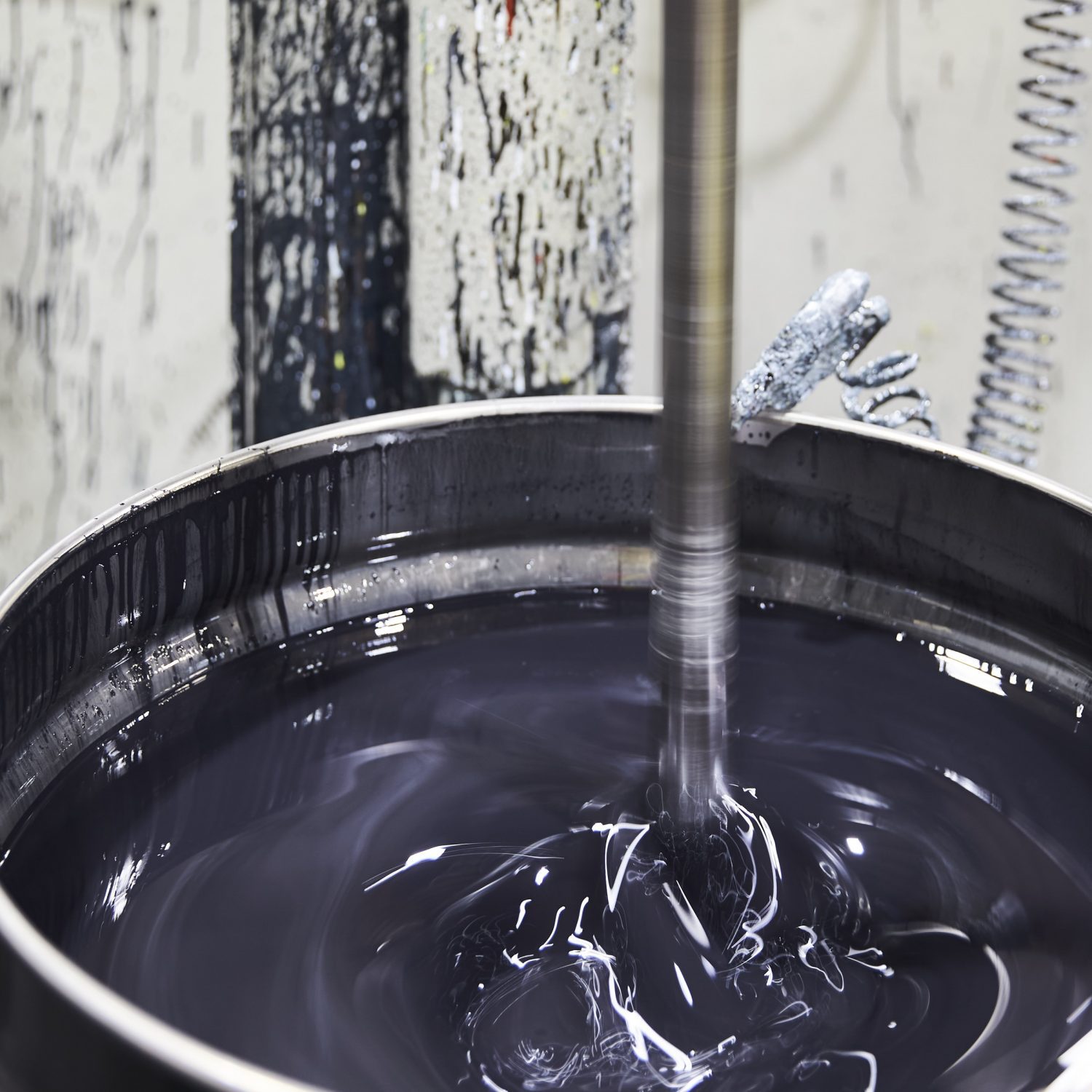
That’s where a company like Baycoat comes in. Canada’s largest steel coil coater paints more than 200,000 tons of steel a year, in just about any colour you can imagine. “People are very precise about their colours,” says Laura Coubrough, Technical Service Member at Baycoat. “We have a huge variety of whites, because customers are very specific about what they need for their particular projects.”
Red and Yellow and Green and Brown and…
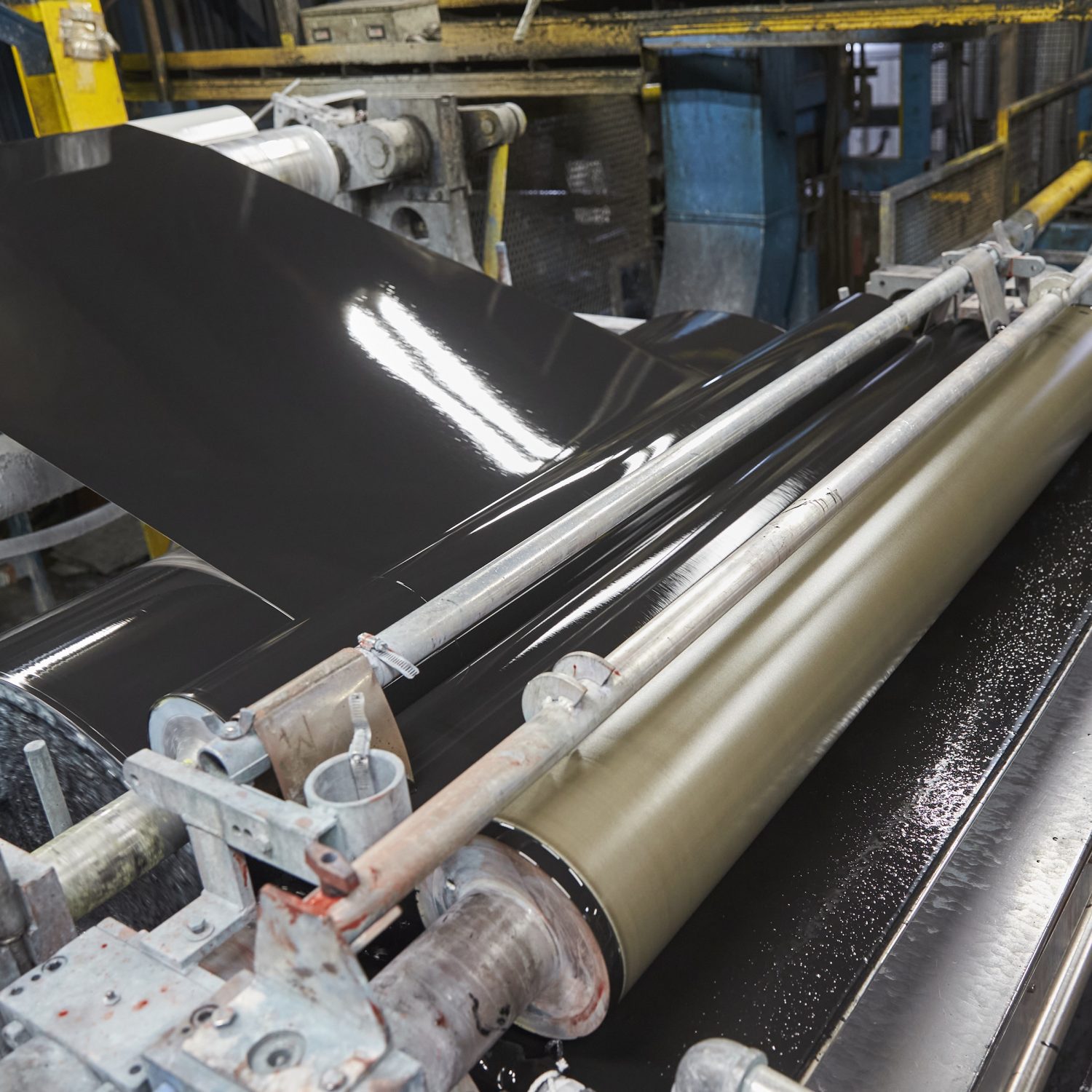
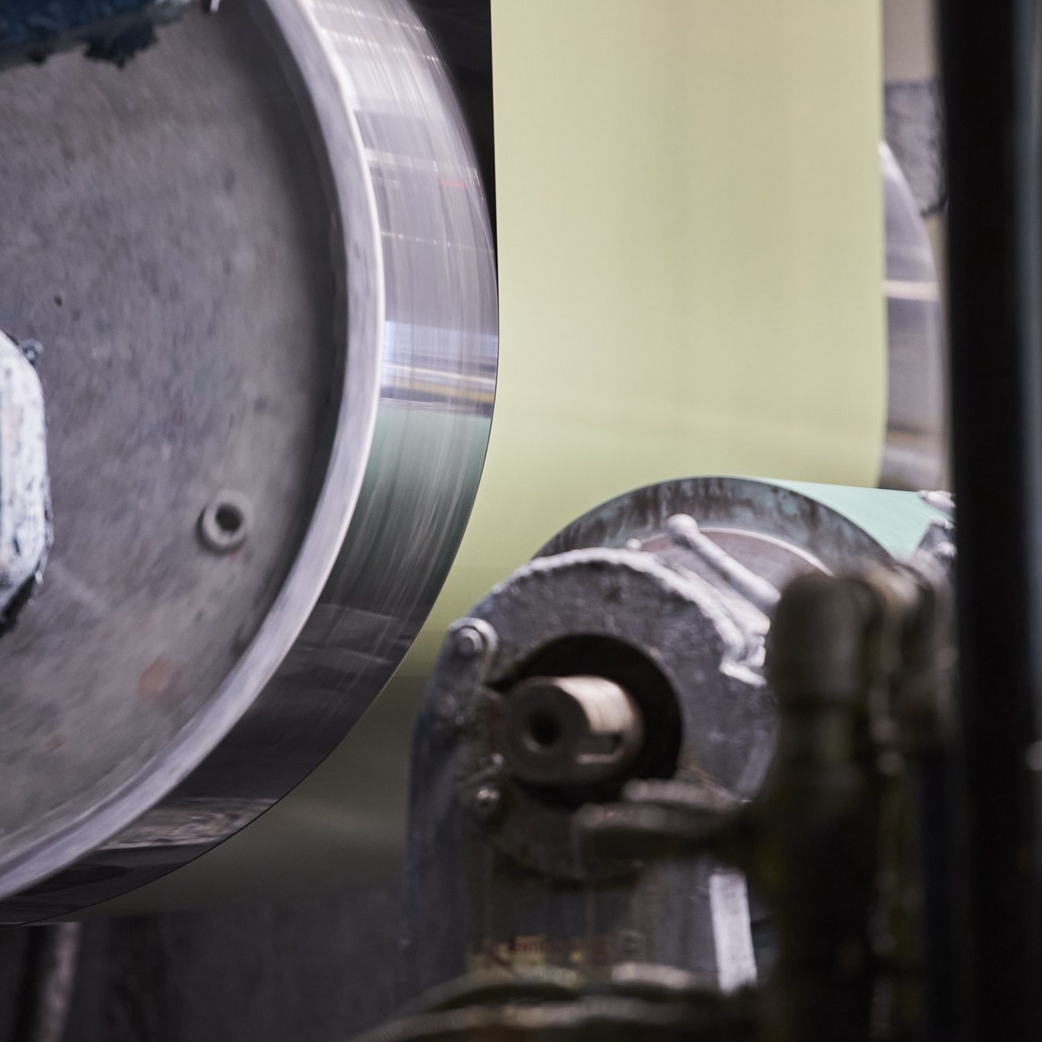
Baycoat’s advantage is specialization, focusing entirely on the painting of the steel. Coils are shipped to Baycoat from the mills, which are then painted in their plant. “We source, prepare, apply and test the paint to ensure it meets or exceeds all quality requirements prior to shipping the coated coils to the end customers,” says Coubrough.
“If we have the colour of paint in stock, we can process an order in one or two days,” explains Coubrough. “For a more exotic colour, it’s about two to three weeks from order placement to completion. Occasionally more vivid colours like, a bright orange, for example can take a bit longer to ensure our customer’s high expectations for their colour are met.”
Baycoat is well aware of the technical needs of their painted steel. For Baycoat, any paint needs to complement steel’s strengths as a construction material: it needs to be durable, flexible, and adaptable. The colours must weather well and have to stick to the steel. It’s more of a science than an art, even if the end result is beautiful.
“We ask a lot of questions when we develop a new paint for a customer,” says Coubrough. “We want to know about the end use, the performance needs, and other requirements.” She starts counting off her fingers: “Where on the building is the steel going? How severe are the bends? Does it need a foam adhesive backing? What other further processing will the coated coil be subjected to?”
“When assessing colour, we need to consider the viewing angle, the light sources, where we are in colour space and what adjustments can be made to achieve the final desired colour.” she finishes. “We need to make sure that the final colour produced matches whatever sample we’ve been given.”
All of those needs together dictate what coating Baycoat will use on their finished products. They have a variety of branded product lines of paint, each developed for a variety of end-uses, including their Barrier embossed PVC, 10,000 Series PVDF and their Perspectra+ SMP. “But the vast majority of the paints we run are SMPs - Silicon-modified polyesters,” explains Coubrough. “It’s durable, has excellent weatherability and it runs really well on our lines.”
Caring About Colour
That colour process meant that Posel was able to match Giant Tiger’s brand yellow exactly with the IMPs. She says that the Giant Tiger head office didn’t have to be yellow, but that it was a choice by her design team. “They didn’t necessarily say, we want a yellow building,” she says. “That was just something that spoke really strongly to us. And we felt that it should be integrated.”
It’s this focus on brand that puts GKC a step above, says Posel. “We do a lot of commercial projects with big clients who have a strong branding presence. So, even if it wasn’t a client request, we want to do it because it creates a strong link between the building and the client,” she explains. “It also gives the client a point of pride to see their colours projected onto the architecture. They’re very proud to see it.”
“It’s about relationships. We build relationships with our clients,” Posel says.
And colour is a necessary part of that relationship. “When you can say to the client, ‘we can match your colours,’ that just shows that you care about them,” she goes on to say. “When you put in that effort, it’s recognized and rewarded.”
