One Home, Two Home, Red Home, Blue Home
Picture-perfect residence coming to a postcard near you
Story: Ian VanDuzer
Photography: Daniel Banko
In the middle of the North Atlantic Ocean lies an island that locals affectionately call ‘The Rock.’ If you haven’t brushed up on your east-coast lingo – or seen the hit Broadway show, Come From Away – you may recognize it by its more traditional name: Newfoundland.
Unique in culture, history, and geography, there are many things that make Newfoundland special: the most concentrated moose population in North America; a Viking settlement; and one of the Four Corners of the World being amongst them.
Hey, it even has its own unique time zone! But none of these compare to the special vibrancy and friendliness of local Newfoundlanders.
And nowhere is that friendliness and vibrancy more apparent than in the colourful houses and sheds that dot the coastline, housing those same accommodating, friendly people.
“Newfoundland is a special place,” says Sukhdev Toor, President and CEO of Manga Hotels. He first visited Newfoundland’s provincial capital St. John’s in 2009, scoping out locations for a hotel Manga was building. That first visit lasted just a couple of nights, but the impression really stuck with him.
“It’s a beautiful city,” he reminisces. “And the friendliest people!”
St. John’s – and its people – left such an impression that Toor immediately started to look for reasons to return. It took a few years, but opportunity eventually came knocking.
Something New for Everyone
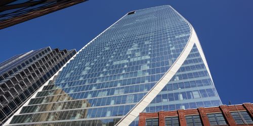
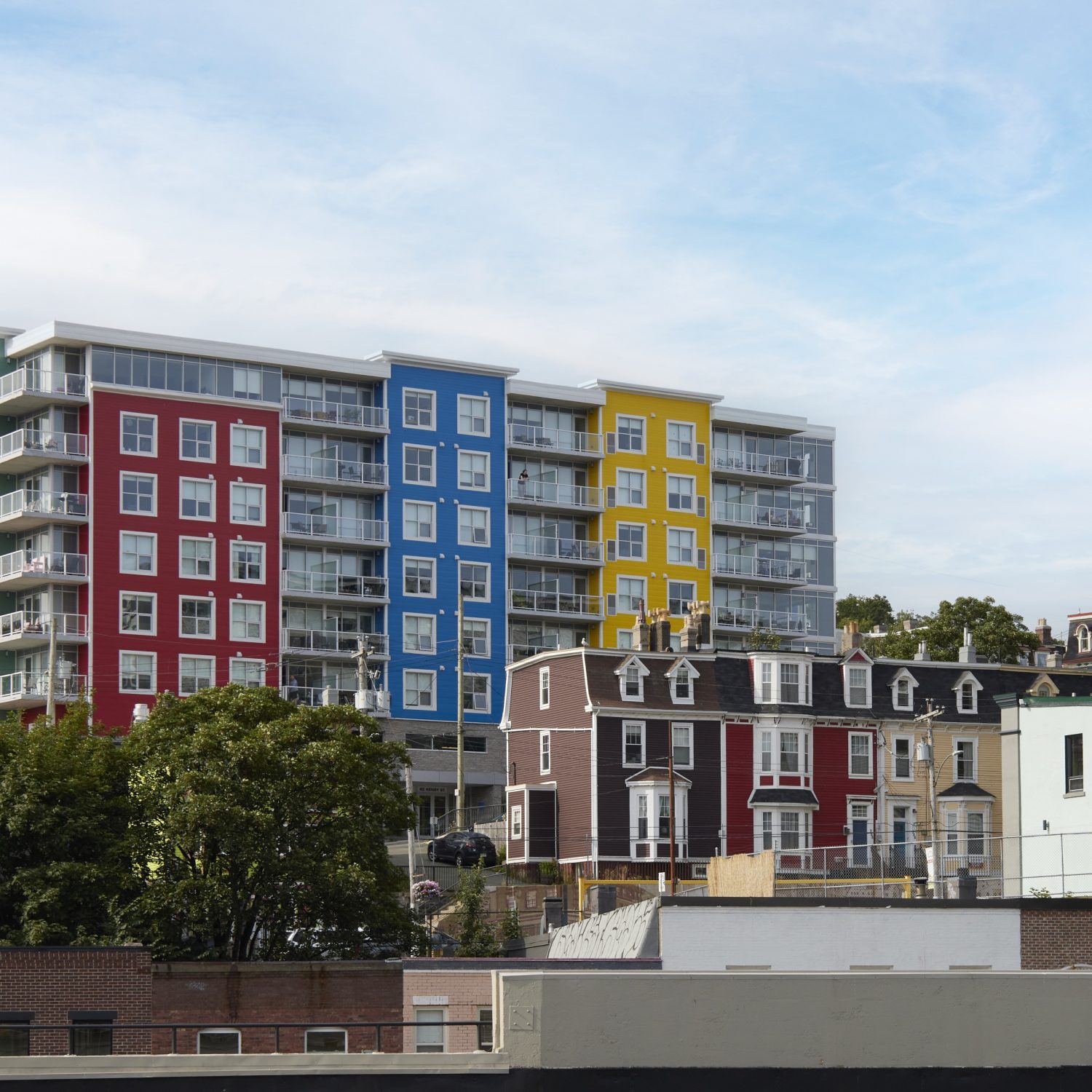
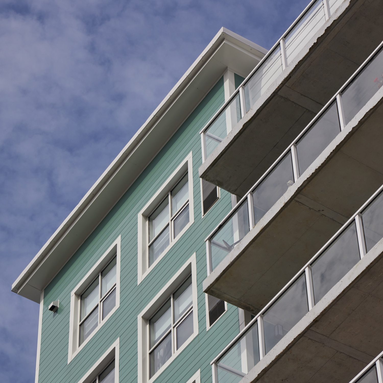
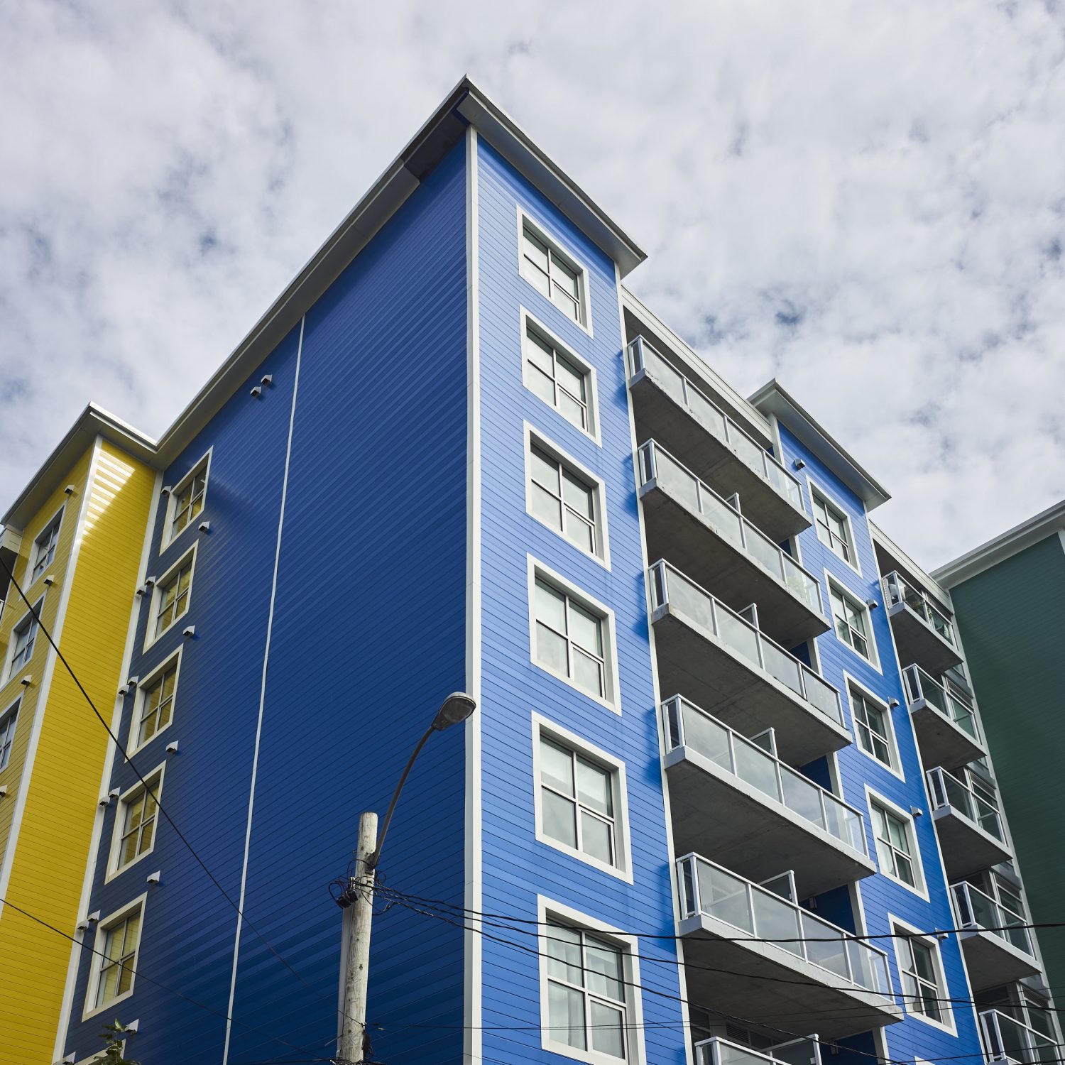
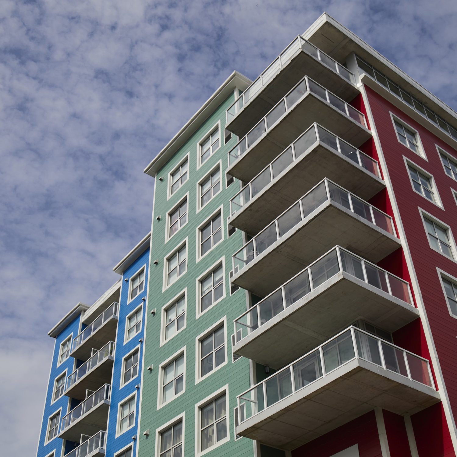
Nestled in downtown St. John’s within view of the Harbour, the Star of the Sea Residences building sneaks a peek over the smaller rows of houses surrounding it. It’s a gleaming, colourful luxury apartment building that fits right in with the St. John’s aesthetic.
For Toor, it represents a new opportunity, not just for St. John’s, but for his company as well.
As evident by the name, Manga Hotels mostly builds, owns, and operates hotels across North America. But when a residential plot became available near St. John’s Harbour, Toor leapt at the opportunity to build his first residential building.
It was about more than diversifying Manga Hotels’ portfolio.
It was a challenge, and an opportunity to do something different. “Hotels are very simple,” Toor explains.
They have stable, consistent designs and façades. “With residences, you can do more,” he grins.
And if he was looking for a vibrant, beautiful city to build his first apartment complex in, he could not have chosen a better site.
Houses of Another Colour
Of all the visual landmarks of Newfoundland, few are as recognizable or as iconic as the colourful homes that dot the coastline.
Painted in vivid reds, blues, yellows, purples, and greens, these houses are featured on post cards, calendars, and are staples of the province’s stunning tourism Ads.
There are different theories as to why these houses are so colourful.
Some say that they were painted brightly so that fishermen could see them as they were returning home through the fog and rain that often blankets the island. Others say that, not wanting anything to go to waste, locals used leftover paints from their fishing boats to paint their houses sheds.
Whatever the reason, the colourful homes of Newfoundland inspired the building’s architects.
“We wanted to fit into the local colour and culture,” says Stephen Mauro, Principal Architect with Chamberlain Architecture Services, who worked on the project. “So, the Jellybean Houses were our first concept.”
“We needed to fit the vibe,” Toor agrees.
“That’s what St. John’s is about. We don’t do colours like that here in Ontario.”
Siding with Steel
Integration was particularly important because the Star of the Sea was always going to stick out, at least a little. It’s a six-storey apartment building in a residential area where most other buildings are only two or three storeys tall.
Toor and Mauro recognized that they were outsiders coming into a close-knit community, and they wanted to show that the culture and heritage of Newfoundland was appreciated and respected.
“We wanted to make something that the city and the neighbours could be proud of,” Mauro says.
Chamberlain worked closely with Manga on a second take of the Star of the Sea plans. The initial ideas designed by another architect – were somewhat drab. “The building originally was going to have concrete siding,” Mauro remembers. “We just knew we could do better.”
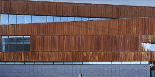
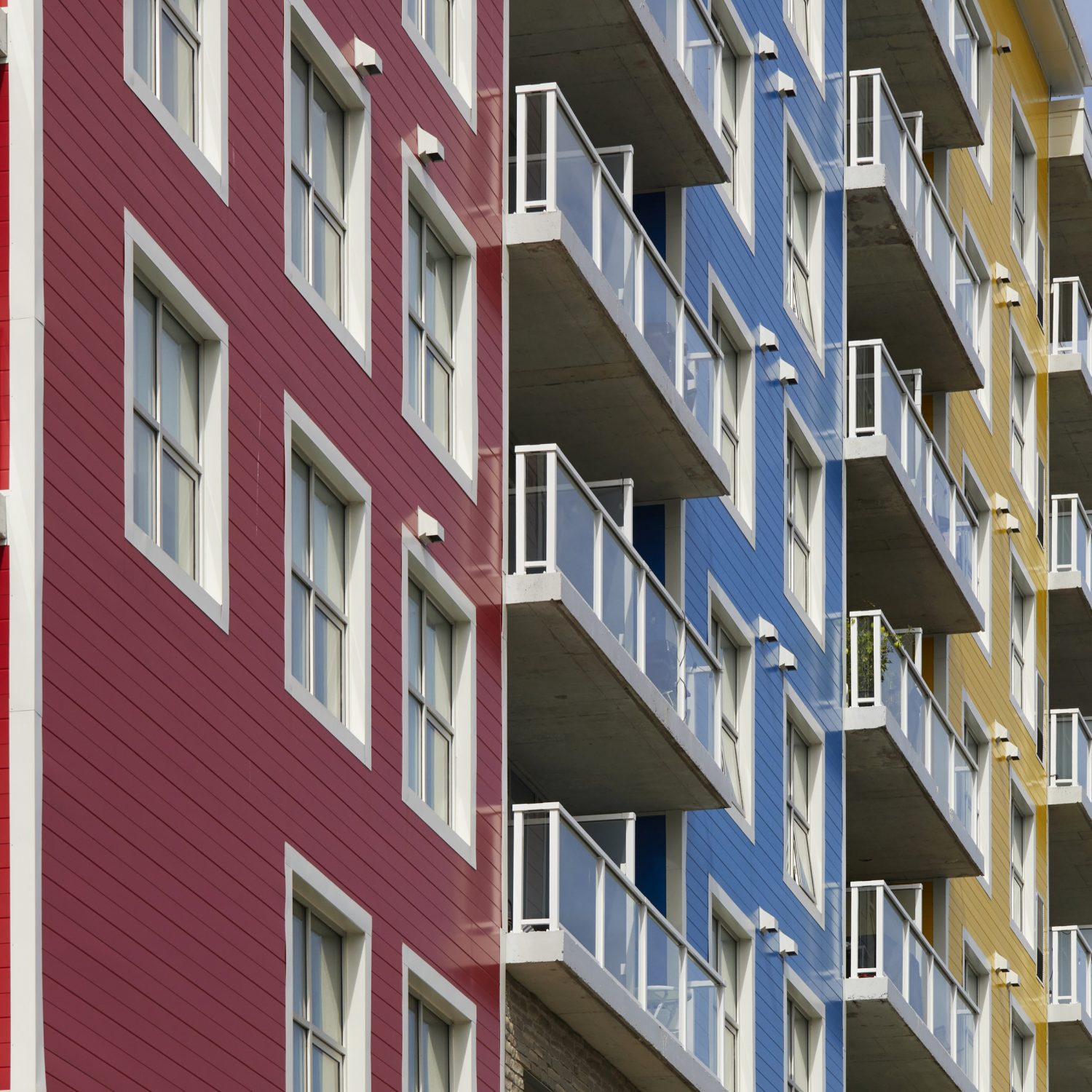
Mauro’s approach was to use treated steel panels on the exterior of the building to mimic the colours of the nearby Jellybean Houses in downtown St. John’s. “Steel siding is usually more for industrial buildings,” Mauro says. “But it can really fit for residential buildings, too.
“We’re seeing steel be used more and more.” (Mauro says that his own house uses steel siding, and that he loves it.)
Weather was another consideration to be confronted. Look up ‘weather-beaten’ in the dictionary and you are sure to find a picture of Newfoundland.
As a remote island in the North Atlantic, Newfoundland has famously stormy, grey, and wet weather year round. Coating the steel in a protective finish solved two problems: how to integrate the Star of the Sea into the surrounding neighbourhoods, and how to protect the steel panel from rusting or other weathering effects.
Toor remembers feeling trepidation about Chamberlain’s first plans. “I was worried about the rust.
I was convinced that the colours would fade,” he admits. “I was concerned, 100%. But somehow, they were right! Colours are now much better than they used to be.”
Speaking of colours, supplier Agway Metals used Baycoat to coat the metal panels, mixing their Perspectra Plus colour line with a variety of other Baycoat Standard and Exotic colours to achieve the exact shades of blues, reds, yellows, and greens Mauro and his architecture team selected.
Even the parking spots provide room with a view.
Chamberlain and Manga needed the brightly-coloured steel to add personality to the building, because the rest of the design was a challenge. “They call it ‘The Rock’ for a reason,” Toor says of the province.
The residence building is built on a steep slope – an inescapable challenge in St. John’s – and the lack of soil meant that digging down would immediately result in hitting solid rock. “It’s difficult to take out that rock,” Toor winces, remembering.
Instead, Mauro designed the building so that it fit the landscape. The building “zig-zags” up the slope, which conveniently added to the Jellybean House effect he was going for (“We got a bit lucky,” he laughs). And instead of underground parking, lots are integrated above ground into the structure itself. “Even our parking spots have a view!” says the caption on one of the building’s Instagram posts.
In the end, it was a design so complete, nothing was overlooked. Except the St. John’s Harbour!
But weather and rocky slopes weren’t the only challenges to contend with. As a remote island with a small population, there simply weren’t enough available tradespeople in Newfoundland to work on the building. Contractors had to be shipped in, along with the bulk of the building materials. That drastically raised the budget compared to a similar building project on the mainland.
Since most of the building is poured concrete, Chamberlain needed to find places where they could save money whenever they could.
Steel, once again, was the answer.
“Cost is everything,” Mauro explains. “Having a material that’s cost-effective that also looks nice is great.”
The standard width of 12” made the panels easy to ship, cutting down on the hassles of transporting the building materials to St. John’s. While the width was standard, the length of each panel was specified by Chamberlain. Agway can produce panels of any length between 1’ and 45’ – a versatility Mauro took advantage of.
Thanks to that steel siding, despite being new, Star of the Sea Residences has never felt out-of-place amongst the age-old character and colours of St. John’s.
It’s a building that wouldn’t fit in anywhere else, which is why it fits in perfectly in Newfoundland.
Specifications
BUILDING OWNER/PROJECT COMMISSIONER:
Manga Hotels // mangahotels.com
ARCHITECT:
Chamberlain Architects // chamberlainipd.com
GENERAL CONTRACTOR:
Maxim Construction // maximconstruction.ca
SUPPLIERS, FABRICATORS, INSTALLERS:
Agway Metals // agwaymetals.com
PRODUCTS:
Profile: HF-12
Colours: Brite Blue, Bright Red, Brite Blue, No Frill Yellow, Pacific Turquoise
